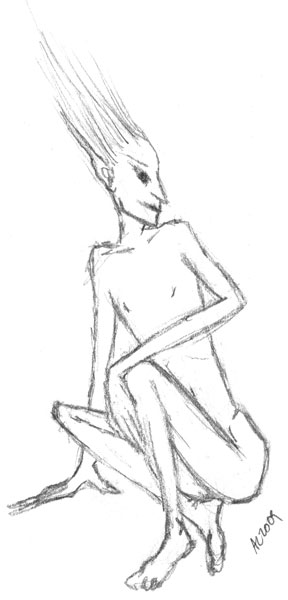
Wood Sprite by Amy CrookOne of the things I’ve been doing lately is trying to change my relationship with money — feeling like there’s plenty of it, like I’m really allowed to have some, and like I have enough to share. I’ve also been trying to shift my professional focus from design to art and illustration, to let my creative side feel like it has plenty and let go of the ingrained image of the starving artist.

As of yesterday, I’m doing two things:

  1. I’m posting some kind of art every day at Antemortem Arts, whether it’s a sketch or a finished painting, for sale or sold, unsaleable or just something I want to keep around for myself.
  2. I’m donating 10% (of the gross, rounded up to the nearest dollar) of all my art and Etsy sales to charity.

I’m starting with Kiva, and at the end of May I’ll give them a lump donation of everything I’ve saved up for April and May. Then I’ll change to a new charity — probably the Electronic Frontier Foundation. I’ll rotate every month or two so that I can give to the causes that call to me, that always seem so endless when trying to choose just one.

So, what do you think? Would it feel better to you, as a supporter of the arts, to know a part of your money was going directly to another good cause?


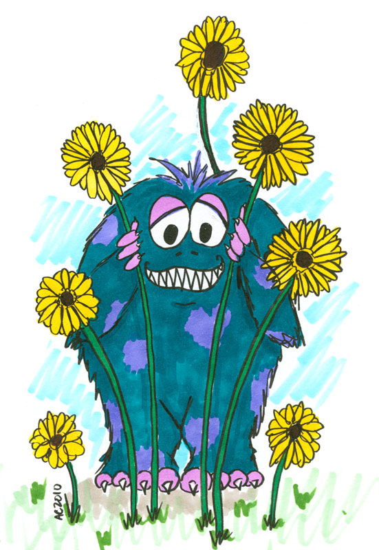
Cute Monster by Amy CrookEveryone has Monsters.

They’re those voices in your head that whisper discouragement and negativity, those stucknesses and blocks and fears that keep us from moving forward. I’ve got a few of my own, and I bet you do, too.

The little guy on the left there is one of my Monsters — he just wants to be friends, but his big scary teeth can get in the way of safe snuggling. Still, having seen him out in the light, I know he doesn’t really mean any harm.

The brilliant Havi Brooks has an awesome-looking new product in the works: The Monster Manual and Coloring Book*. And I really, really want it! But it’s tax time and money is tight, so I’m doing a limited-edition offering to help fund my own Monster adventures:

Draw Your Monster

We’ve all got our Monsters, real and imaginary. Do you have lurking fears that you’d like to bring out into the light? Is your dog sometimes a wicked creature? Do you just really want a cartoon of a cute monster?

I’ve got you covered!

For $59, you, too, can have your very own Monster — I’ll even mail you the original, or a high-quality print if we end up going digital.

Cthulhu Egg by Amy CrookWhat I’ll need to get started:

  • A snail mail address for your original monster to be mailed to you.
  • To talk about your Monster! If you’ve already got a vision of your Monster, great! If not, we can email back & forth until we have a clear idea of your Monster’s form. Questions to start with:
    • Fuzzy? Lizardy? Bat-winged? Multi-eyed? Insectoid? Tentacley? Fog? Wall? Creeping Black Void?
    • Is your Monster growling, hiding, making puppy eyes? Sheltering, blocking, posing nonchalantly?
    • Color preferences?
  • Generally speaking, I will decide the medium (ie, pen and ink, watercolor, whatever) based on the special needs of your Monster.

I’ve temporarily reopened commissions for these — if you’d like one, just buy my Be a Cartoon package and let me know you want a Monster instead.

Chibi Cthulhu Feeds His Shoggie by Amy Crook
*Not an affiliate link so there nyeah.


Dance of Shiva Cards

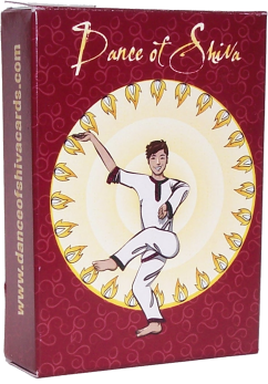
First, I’m excited to see a project that took me a long time and a lot of painstaking work finally get off the ground. Frank Mitchell made a set of Dance of Shiva reference cards, and he hired me to illustrate the 8 arm positions in 64 combinations. I also made the results press-ready for him, so all he had to do was approve the images and then sit back while I sent it all to press (and pay the bills, heh). There was a card back and box art, and while I haven’t seen them in person yet, I’m crazy excited.

Shivanaut by Amy Crook

Shiva Nata Card Box art by Amy Crook

Cartoons

It’s been a week of getting back to cartooning, and I finally finished up most of the pending projects I had.

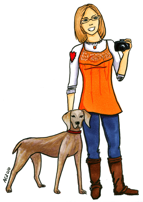
Elizabeth Halt asked me to draw her and her gorgeous puppy, Atlas:

Elizabeth Halt by Amy Crook

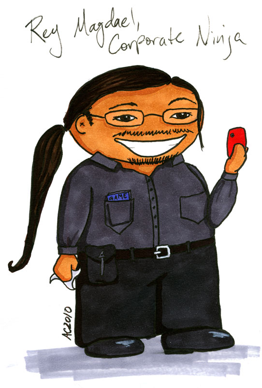
And then my friend Rey wanted to be immortalized as a Weeble:

Rey Magdael by Amy Crook

And finally, I drew up one of my Monsters (a la Havi Brooks), to show that he’s really a friendly, wee chap that’s worried for me:

Friendly Monster by Amy Crook

Beach Cottage

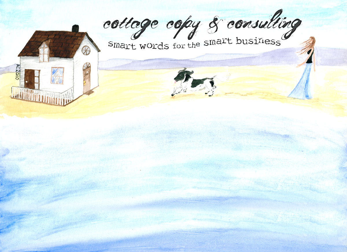
Finally, I’ve got a sneak peek for you at the header for Cottage Copy‘s new look, an original watercolor including the Cottage Copy Spaniel and Holly’s dream beach cottage:

Cottage Copy Header by Amy Crook
(Click to see it in all its full-size glory)


Bridget and I are trading guest posts today — enjoy her unique insight!

Photo Courtesy of Alicia Dickerson
I work as an intuitive. I have a very unique job. I look at my clients’ chakras and in doing so, I see metaphors about their lives. Each chakra, to me, looks like a little room, or a set on a stage.

The intuitive experience is strange. It’s like Salvador Dali and Frida Kahlo and Lewis Carroll got together and had a party.

In the chakras of my clients, I see swirling or dancing furniture. I see strange people. I see thorns. Broken Glass. Laughing Children. I see colors forming and reforming.

It’s my job to see it and bring it out in the open where it can be useful for people. We use this information to help the client transcend their current conflicts and move forward in their lives.

In intuitive work, we take what’s at the edge of consciousness and make it conscious. We make the metaphors that shape our lives visible.

I want my blog to use visual metaphor just as beautifully, or as interestingly as my clients’ chakras do. So I look to photos and illustrations that capture the feeling of odd, yet familiar.

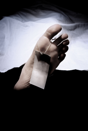
For example, I was recently writing about working at jobs that don’t sustain you. I wrote a blog post called “What to Do If Your Job is Dead.” Originally, I wanted to find a chalk outline of a dead body. I thought it’d be good to show that you shouldn’t stay in a job that’s killing you, because all you’ll leave is a chalk outline.

I couldn’t find a picture that I liked, but I found this foot with a tag on it, and a sheet behind it, that at first glance looks like ominous clouds. Feet are funny, too. There’s some dark comedy to this shot. It’s memorable, dreamlike and yet, it makes a point. Put a tag on it, it’s done.

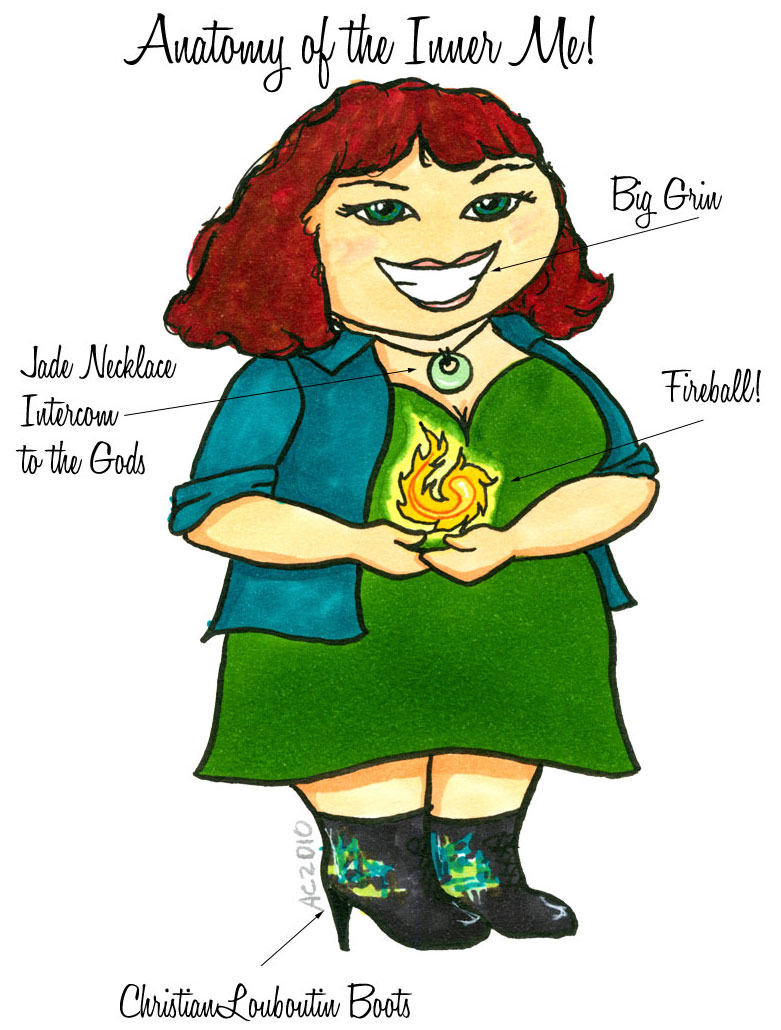
Another example: I did a series on the Inner Me. This is an idea where we can talk with our soul and our soul talks back. We can access the warm wisdom within us. I wanted somebody that looks like me to appear in these posts. Since the soul seems ethereal, a hard to pin down concept, I knew I wanted the opposite. I wanted something very warm and accessible.

Coincidentally, I had taken Amy up on her Cartoonify Yourself offer. She had made a cartoon of me with a ball of fire and awesome boots. I realized that I was looking at the inner me! So I used her in a series of posts. Now I use her to illustrate my daily soul notes, a little note from the inner me for my readers. She will come up from time to time as I play with this idea of the inner me.

Bridget Pilloud by Amy Crook
The most important take-away from this approach to the visual in my blog, is that it is mostly done from the place of “no-thought”. I don’t have a calculating plan of how I want my blog to be. I just find images that speak to me with visual metaphors that personify the idea that I am getting across.

Bridget Pilloud is an intuitive guidance counselor, an intuition teacher and a facilitator of energetic healing. She also works with people and their pets. Her work can be found at http://www.bridgetpilloud.com and at http://www.petsaretalking.com. On Twitter, she’s @intuitivebridge.


Cartoon Me by Amy Crook
Actually, it’s two contests in one. I’m promoting both Not Dead Yet Studios and its sister site, Antemortem Arts, so I’m giving away a prize from each site.

The Prizes:

  • Be a Cartoon! Get yourself made into a nifty cartoon character, for use in web or print, however you want to do it. Since it’s a giveaway, I’ll even send you the original free! A $45 value.
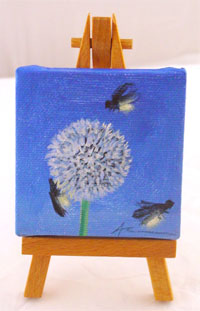
  • Tiny Painting! Brighten up a corner of your world with a teeny little painting on its very own wooden easel, of nearly anything your heart desires. A $60 value.

Thistle by Amy CrookThe Rules:

  • Comment here to enter, and include a valid email address so I can contact you if you win!
  • Let me know in your comment whether you want the Cartoon, the Painting, or Either. It will be two separate drawings, with two different winners.
  • Random numbers will decide, probably using polyhedral dice for maximum geekiness.
  • Drawing will take place at the end of the day on Friday 1/8/2010. Unless I forget, and then it’ll be Saturday.
  • Winners will be notified and, once they’ve accepted, posted here so you all know who got lucky.
  • Prizes are good for 6 months, though of course I’m hoping you’ll be so excited you’ll want to get started right away!

Got any questions? The comments are good for that, too, or you can email me privately.

Good luck!

Entries are now CLOSED! Winners announced soon.

 
Eddie, Jessica and Lucy

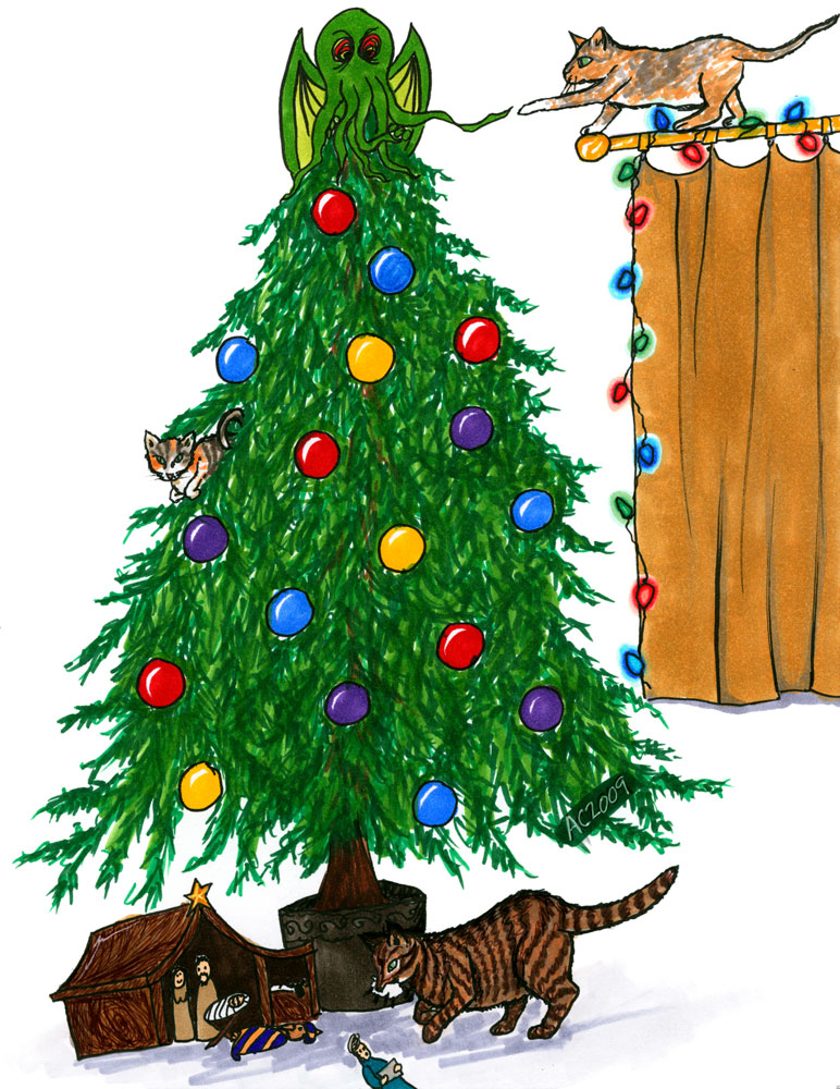
This year two of my very good friends commissioned me to design their Christmas cards, and I had great fun with the illustration. They’ve got 3 cats, who we decided needed to be the stars of the show, as it were, all up to their usual mischief.

That’s Eddie down at the bottom playing Godzilla with the Nativity, Lucy at the top making contact with the Cthulhu tree topper, and Jessica can be seen playing impostor ornament in the middle of the tree. It’s done with ink & Copic markers, and was a lot of fun (except inking the tree, which was insanely tedious, but I love the effect so I will pretend to myself it was fun).

A Merry, Mischievous Christmas to everyone, whether or not you celebrate — it’s still an awesome excuse for a day off!


Walls thumbnailTitle: Till the Walls Shall Crumble to Ruin
Media:
Oil on canvas, digital photos thereof, InDesign layout & color laser prints on parchment paper
Commissioner: Natalie
Sources: “The Children’s Hour” by Longfellow, and the Cezanne font
Notes: I am a terrible art photographer, so please excuse the uneven colours and strange shadows and glare. This project took ages (finding a box to ship it in was an unexpected challenge!) but I feel like the time spent was worth it, given the end result.

I wasn’t sure how it would all work out when Natalie came to me wanting a painting. We talked for a long while on gmail, bandying ideas back and forth, drawing out the images she was really interested in, and over the course of days the idea of the triptych was born. The canvas itself is smallish, 10x20in, and I really enjoyed working in the odd dimensions with what felt like infinite sky stretching up above the tower slowly crumbling away on the cold winter ground.

There was a story to Natalie’s choices, but it’s not really mine to tell. Suffice it to say she is happy with the results, and hopes to have it hung in her new home soon.

Since my own walls are yellow, rather than white, I took a photo on a sheet to give one an idea of how it looks all assembled.
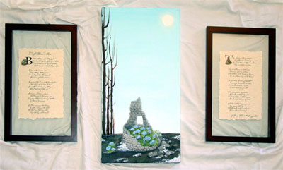
Till the Walls Shall Crumble to Ruin

Here’s a better shot of just the painting itself, cold winter sky and stretched above and the snow melting into the dark, frozen earth, and the hydrangeas bravely blooming on anyway.
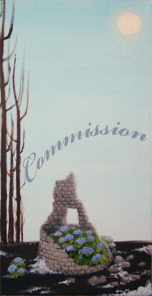
Till the Walls Shall Crumble to Ruin

You can see that I found “float” frames in a dimension that’s similar to the canvas, tall and thin, and we split up the poem’s stanzas into two groups. On page 1 we have a photograph of the little stray hydrangea bush that was blooming valiantly outside the tower’s shelter, huddled up to our leading B. On page 2 I used a photo of the tower from the middle of the painting process, before the bushes were painted in, to allow the T to grow up out of it unencumbered.
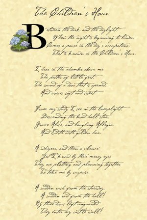
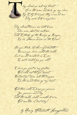
The Children's Hour 1

The Children's Hour 2

And now, a bit of the process! I’m doing it backwards this time so that those who just want to see the final don’t have to scroll. 😉

The very first step was to create that cold winter sky and the hard, dark ground below. I actually was really tempted just to keep the canvas once it was done, there was something really appealing for me about the juxtaposition of colour and shade here, but I was good and kept going.
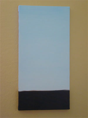
Step 1

Then, once the background was nice and dry, I put in the sun and the trees, and blocked in the shape and shade of the tower.
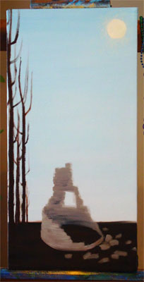
Step 2

Next the tower got shade and details put in, the shape of the bricks coming out. This is the stage that I photographed for the illuminated letter T.
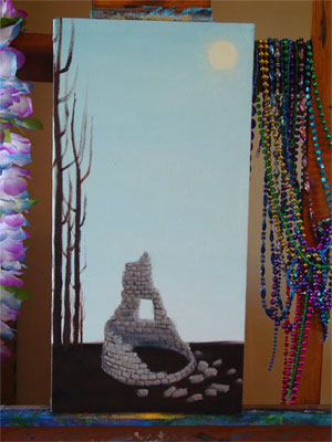
Step 3

Leaves! There were bushy plants painted in, just waiting for their blossoms.
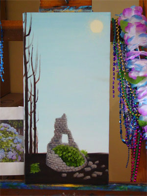
Step 4

I’ve skipped a few stages in here, but the blossoms went in and, some snow was added to the ground as well as shadows and some extra dimensionality for the scattered bricks on the ground. At this point I hung it in the living room to dry so I could look at it in low light, and the only real difference from this to the final is some extra highlighting and shading, and another layer of soft glow around the sun.
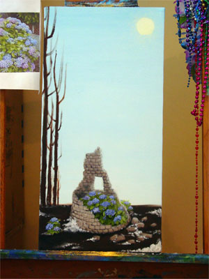
Step 5

And of course, there’s the finished product, which you can scroll up to see again!

 

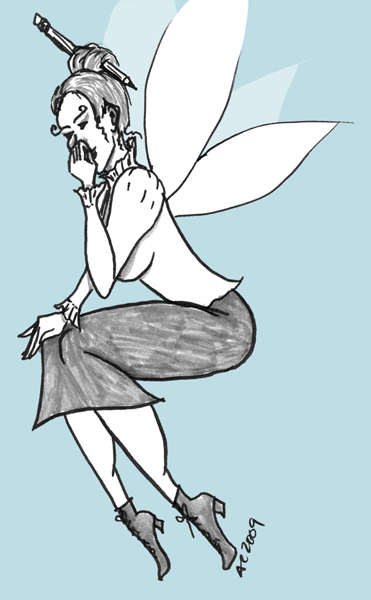
The incomparable Havi Brooks wrote on her blog about her inner Writer Havi (she said “Writer Me” but you can see how that would be confusing), a Tinkerbell-sized fairy with a prim pencil skirt and her hair held up in a bun. She was also laughing hysterically, and the image of her, proper and delicate and spinning around while she giggled helplessly stuck with me. In fact, it brought up the idea of my own inner Artist Me, the svelte, together artist who actually paints more than once every week or so.

Inspired, I managed to eke some time out of a busy week to draw!

First, we have Writer Havi.

She’s in black & white (on a “fluent blue” background) because all photos I see of Havi are b&w.; Selma gets full color, but Havi’s always tastefully done in shades of grey.

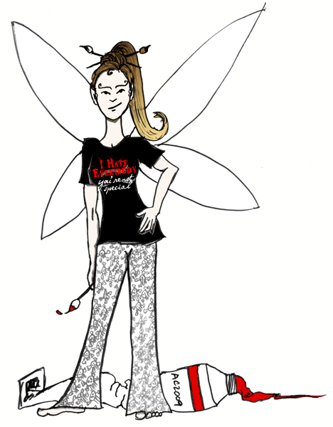
Next, we have Artist Amy.

She got a little color, and a t-shirt I’ve decided I need to find or make on Cafepress. She also has a non-black version of my Jolly Roger pajama pants on, and something resembling my current hair color, so go her!


Let’s hope that Havi & I can both bring these fairies out to shine more often!


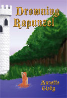
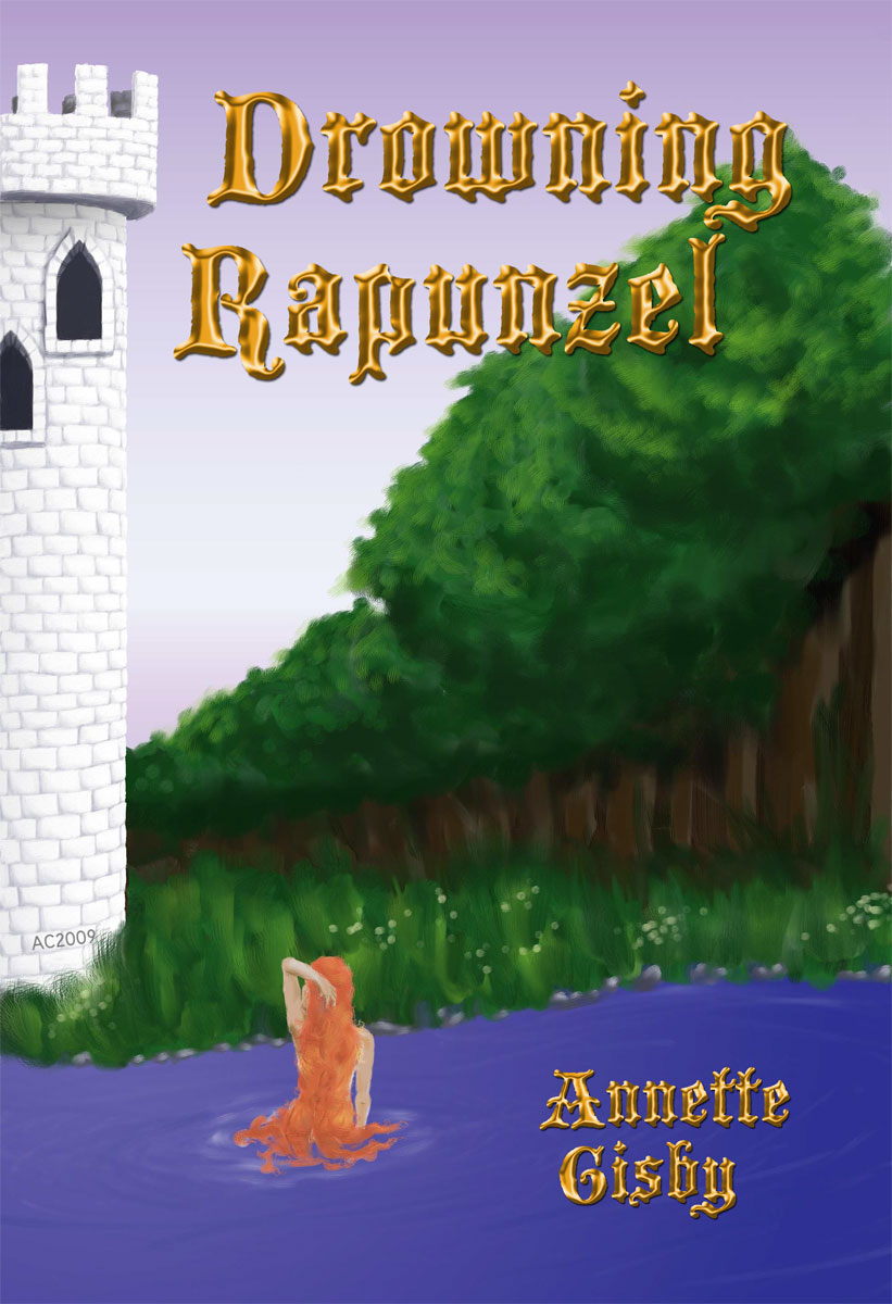
Drowning Rapunzel thumbnailThis is one of the commissions I finished right before I ran off for vacation, a book cover for Annette Gisby’s novel Drowning Rapunzel. She originally asked for print-resolution digital art (6″x9″ with a 0.25″ bleed, a fairly standard “oversize paperback” sort of size), which I did using Corel Painter IX. During the process of having the cover made, the ebook version got picked up by an epub, who allowed her to supply her own cover.
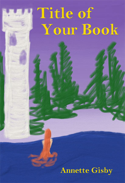
A tiny plug, if you want to commission me for art, just drop me a line and we can discuss pricing and deadlines. Don’t be afraid that I’ll hard sell you — I only have 3 spots left in my art queue at the moment anyway.

As always, you can skip to the bottom to see the finished piece, or scroll through the “progress” to get an idea of how it all came together.

After some discussion and many photos of towers, i came up with this Incredibly Lame “sketch” just to get an idea of positioning and whatnot:

Drowning Rapunzel lame sketch

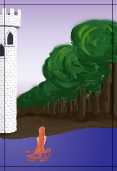
There were a few steps between that and this, but I figured I’d skip to the first real significant progress. I feel the need to point out that the tower took as long as the entire rest of the image combined, and if I never shade another tiny brick again it might be too soon. @_@ The black lines show the “bleed” area, which is what would be cut off in a print book — I personally like the full version better, so I’m glad she got to use it.

Drowning Rapunzel tower done

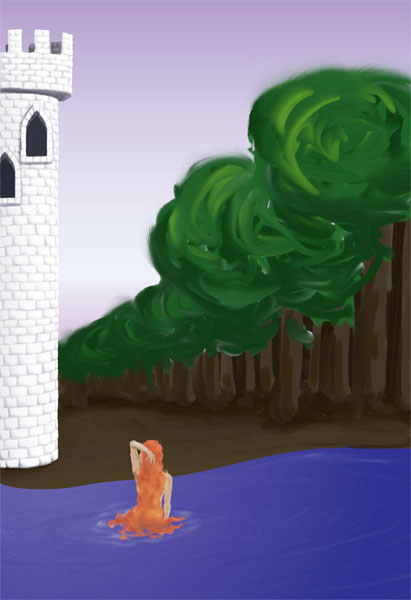
Here I properly drew in the figure of the girl, and shaded the lake:

Drowning Rapunzel lake done

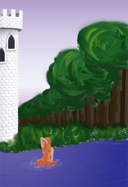
And now, grass! Annette wanted to be sure I wasn’t going to leave our poor Rapunzel on a muddy bank, and it worked out better to have the grass layer put in before shading the trees and whatnot.

Drowning Rapunzel grass done

Here’s the final version, complete with titles added in Photoshop.

Drowning Rapunzel by Annette Gisby
Click the image for a larger version


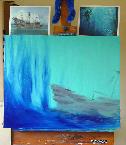
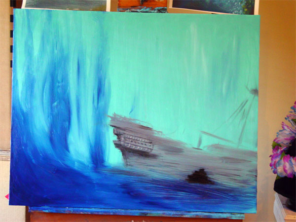
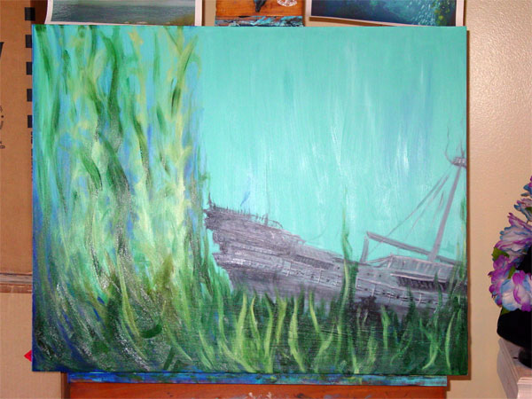
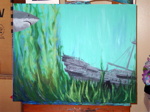
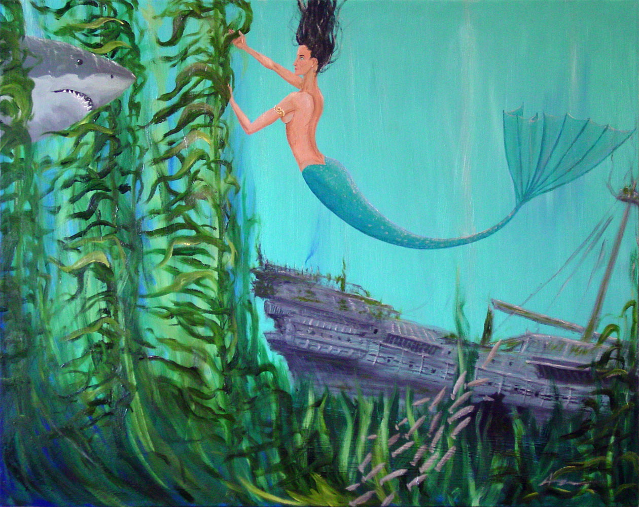
This fall, my friend Jeff commissioned me to paint a gift for his wife, for a combination 5th anniversary and Christmas present. It was an interesting challenge keeping it a secret for two months, but the moment of presentation was a smashing success!

Here’s a bit of the process, for the curious…

The worst thing in the world: a blank canvas.
eeeeevil

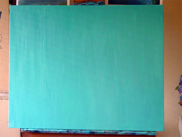
Look, color!
bluuuue

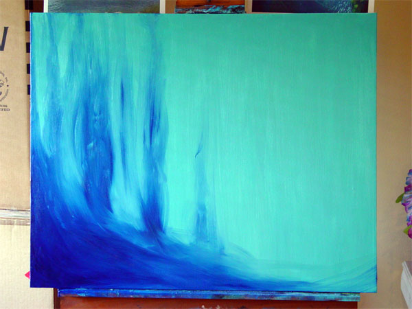
And here’s a little more, getting in the shadows and a vague hint of what will someday be the background.
woooooo

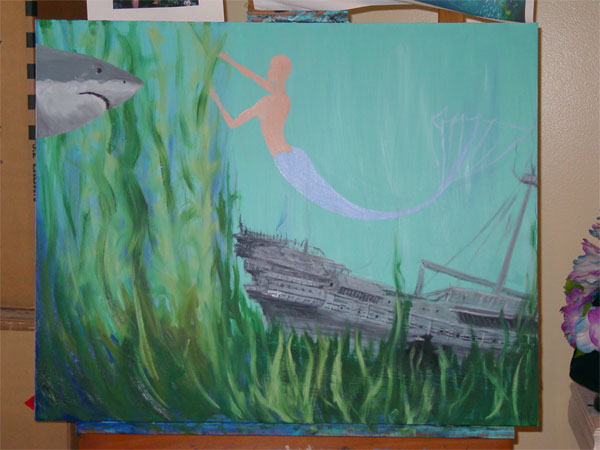
You can see my references taped to the easel now, or some of them, anyway, and the blocked-in color for the ghost ship.
shippy

Some detail going in on the ship:
detail

More ship, and some foliage!
frondy

Rawr! He’s a little toothless, but he’ll get his later.
sharky

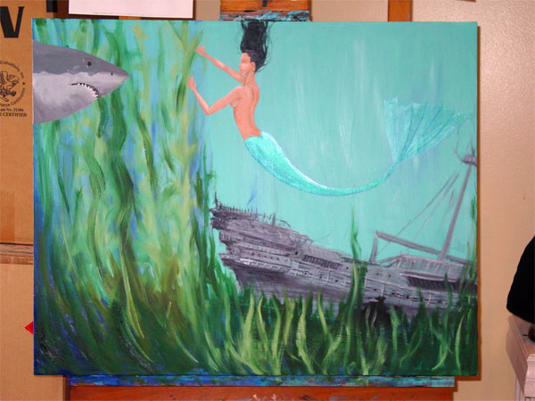
And now we block in our mermaid! The real star of the painting.
pretty

Our shark has teeth, and the mermaid has some color now.
raawr

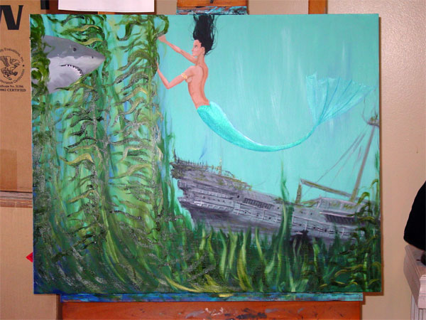
Texture on her tail, and a whole lot of kelp.
whoosh

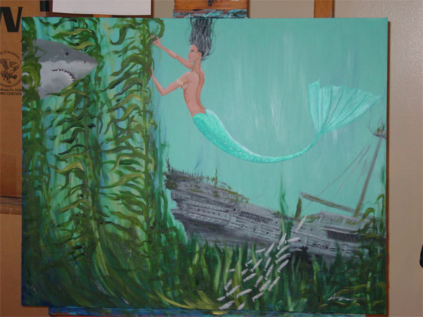
All done except for the lighting. Little fishies!
swimmy


And here’s the final! Click the image for a bigger version:
purty