


Comments Off on Commission: Till the Walls Shall Crumble to Ruin
 Title: Till the Walls Shall Crumble to Ruin
Media: Oil on canvas, digital photos thereof, InDesign layout & color laser prints on parchment paper
Commissioner: Natalie
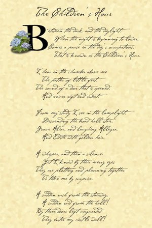
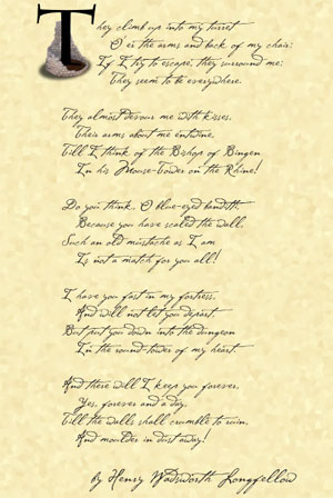
Sources: “The Children’s Hour” by Longfellow, and the Cezanne font
Notes: I am a terrible art photographer, so please excuse the uneven colours and strange shadows and glare. This project took ages (finding a box to ship it in was an unexpected challenge!) but I feel like the time spent was worth it, given the end result.
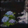
I wasn’t sure how it would all work out when Natalie came to me wanting a painting. We talked for a long while on gmail, bandying ideas back and forth, drawing out the images she was really interested in, and over the course of days the idea of the triptych was born. The canvas itself is smallish, 10x20in, and I really enjoyed working in the odd dimensions with what felt like infinite sky stretching up above the tower slowly crumbling away on the cold winter ground.
There was a story to Natalie’s choices, but it’s not really mine to tell. Suffice it to say she is happy with the results, and hopes to have it hung in her new home soon.
Since my own walls are yellow, rather than white, I took a photo on a sheet to give one an idea of how it looks all assembled.
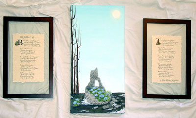
Here’s a better shot of just the painting itself, cold winter sky and stretched above and the snow melting into the dark, frozen earth, and the hydrangeas bravely blooming on anyway.
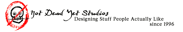
You can see that I found “float” frames in a dimension that’s similar to the canvas, tall and thin, and we split up the poem’s stanzas into two groups. On page 1 we have a photograph of the little stray hydrangea bush that was blooming valiantly outside the tower’s shelter, huddled up to our leading B. On page 2 I used a photo of the tower from the middle of the painting process, before the bushes were painted in, to allow the T to grow up out of it unencumbered.
And now, a bit of the process! I’m doing it backwards this time so that those who just want to see the final don’t have to scroll. 😉
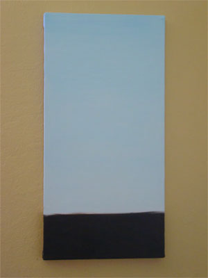
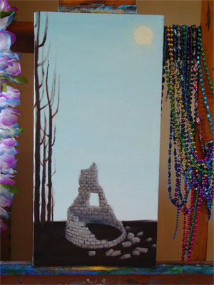
The very first step was to create that cold winter sky and the hard, dark ground below. I actually was really tempted just to keep the canvas once it was done, there was something really appealing for me about the juxtaposition of colour and shade here, but I was good and kept going.
Then, once the background was nice and dry, I put in the sun and the trees, and blocked in the shape and shade of the tower.
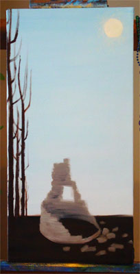
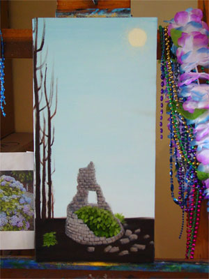
Next the tower got shade and details put in, the shape of the bricks coming out. This is the stage that I photographed for the illuminated letter T.
Leaves! There were bushy plants painted in, just waiting for their blossoms.
I’ve skipped a few stages in here, but the blossoms went in and, some snow was added to the ground as well as shadows and some extra dimensionality for the scattered bricks on the ground. At this point I hung it in the living room to dry so I could look at it in low light, and the only real difference from this to the final is some extra highlighting and shading, and another layer of soft glow around the sun.
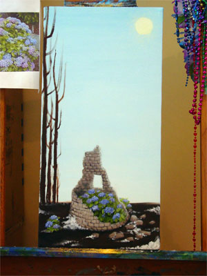
And of course, there’s the finished product, which you can scroll up to see again!
No comments yet.
RSS feed for comments on this post.
Sorry, the comment form is closed at this time.