I’m not originating any ideas here — Ittybiz, Copyblogger, Problogger, Fluent Self and a dozen other blogs have gone over this ground before, and probably dozens of people before them that they learned from. But it never stops being a good idea, and it’s one that’s hard to remember when you’re in the thick of things.

When you’re writing copy to sell people something, whether it’s a product or a service or even an idea, you need three things: Features, Benefits, and a Call to Action. Between these three things, you have to answer what Naomi calls the annoying inner three-year-old question: Why?

Let’s say you have a Widget. We want people to buy this Widget, and maybe even get upsold to the Whatchamacallit package, and you’re so excited about all the features you’ve built into the widget that you want to list them out in lovingly prepared bullet points. Which is great, actually, people like easy lists, but remember:

For every Feature, you need a Benefit.

Tell me what it does, sure, but then tell me why I care. Benefits without features just sound like random bragging, but features without benefits are equally pointless. If your widget perforates to perfection, that’s great. But what does that do for me? Tell me what I can do with those perfect perforations, and how that helps me in my everyday life, and then I’ll be ready to become a Widget owner in a heartbeat.

The last thing on the page (and if it’s a long page, perhaps the third, seventh, and fifteenth) is your Call to Action.

You can sell me on the features and benefits all you want, but if you never actually try to sell me the Widget, then the sale won’t truly be made. People love to be told what the next step is, so remember to point them to it. Whether it’s a blog comment, a sale, or an inquiry for your services, make sure it’s obvious what needs to happen next. And then tell your reader to do what you want them to — or ask, if that’s more your style, though be wary of softening the call to action until it’s more like a gentle whisper.

Remember, for maximum conversion (to use marketer-speak): Pair each feature with its benefit, and end with a strong call to action.

Then you’ll be on your way to Widget Mogul status in no time.


image by johnkoetsierI’ve always had a knack for gift giving — whether it’s for clients or friends or friends-of-friends, I’ve always had that ability to walk through a store and say, “Yeah, they’d love that.” It’s kind of like my superpower, really — it’s netted me many smiles and much gratitude, and made gift-giving a joy instead of an obligation. I’ve even considered making a side business of it, but for now I just use my powers for the smaller good.

I was thinking today that the art of gift giving has a lot in common with the work of giving clients good design — you have to get to know them well enough to figure out what their real “thing” is, and then give them something that highlights it. If it’s a gift, and I know the person loves bats, then I’ll get them something bat-themed that also fits with the rest of their life, like a travel mug for a busy exec or a canvas tote bag for someone who’s going green (or just loves tote bags).

It’s a matter of listening to what they tell you, but also seeing what they show with their actions — sometimes it’s hard to get past what they think they want and down to what they really secretly expect. Like websites, for instance; often people will say that they just want “a presence, because you need that now, right?” But what they really mean is that they want to look like they’re keeping up with the trends, they want people to find them online and give them business that way without a lot of extra effort, and most of all, they want me to make them look good.

In fact, wanting to make them look good is a great motivation for gift-giving, too. After all, those canvas totes not only show off how green someone is, they can say something about their personality, too. And the travel mug can keep the coffee off the tie they got for Father’s day — assuming that’s a goal. And if I ever find earrings with little hanging bats, I know just who I’m going to give them to.


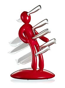
As I was cleaning my kitchen today, I had to move my knife block around, dust him off, and think about him as I rarely do when I’m just snagging a knife. He’s shiny and red, and yes, he has a name — Stanley, which is, for the record, not a name of anyone I know.

Stanley’s a little too tall for my kitchen, but I love him too much to replace him.

The thing is, I realized that part of why I love him is that I have a private myth around Stanley, that I built at some point in the past. I think that, in the absence of useful group myths, and even in their presence, sometimes we make up stories around our things and our surroundings and our lives, myths that are only for us. Or at least I do — maybe I’m the only one, but I doubt it.

I tell myself that Stanley actually likes his knives, and that he only hurts when when one is missing, like the ache where your wisdom teeth used to be, dull and hollow. Of course, the down side is that if they’re ever all missing for too long, he’ll come looking for them — and for me, to remind me never to do that again. Except for the bread knife, which is often out on the bread board with the bread, I do mostly keep him full up.

Especially that big one right in his heart — I wouldn’t want Stanley to have a heartache, after all.


Walls thumbnail
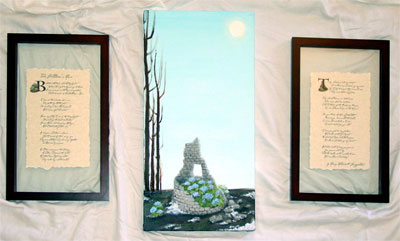
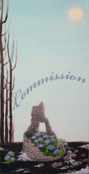
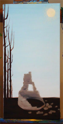
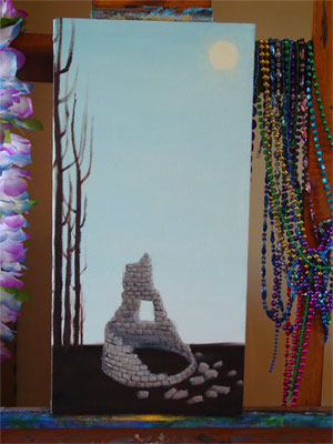
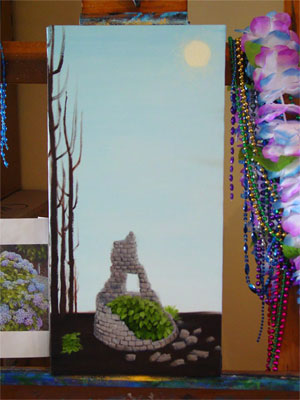
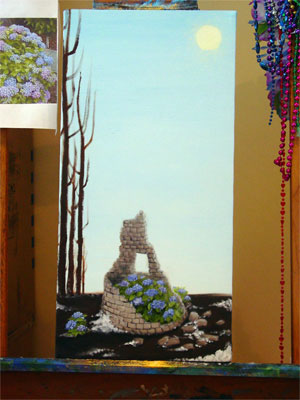
Title: Till the Walls Shall Crumble to Ruin
Media:
Oil on canvas, digital photos thereof, InDesign layout & color laser prints on parchment paper
Commissioner: Natalie
Sources: “The Children’s Hour” by Longfellow, and the Cezanne font
Notes: I am a terrible art photographer, so please excuse the uneven colours and strange shadows and glare. This project took ages (finding a box to ship it in was an unexpected challenge!) but I feel like the time spent was worth it, given the end result.

I wasn’t sure how it would all work out when Natalie came to me wanting a painting. We talked for a long while on gmail, bandying ideas back and forth, drawing out the images she was really interested in, and over the course of days the idea of the triptych was born. The canvas itself is smallish, 10x20in, and I really enjoyed working in the odd dimensions with what felt like infinite sky stretching up above the tower slowly crumbling away on the cold winter ground.

There was a story to Natalie’s choices, but it’s not really mine to tell. Suffice it to say she is happy with the results, and hopes to have it hung in her new home soon.

Since my own walls are yellow, rather than white, I took a photo on a sheet to give one an idea of how it looks all assembled.

Till the Walls Shall Crumble to Ruin

Here’s a better shot of just the painting itself, cold winter sky and stretched above and the snow melting into the dark, frozen earth, and the hydrangeas bravely blooming on anyway.

Till the Walls Shall Crumble to Ruin

You can see that I found “float” frames in a dimension that’s similar to the canvas, tall and thin, and we split up the poem’s stanzas into two groups. On page 1 we have a photograph of the little stray hydrangea bush that was blooming valiantly outside the tower’s shelter, huddled up to our leading B. On page 2 I used a photo of the tower from the middle of the painting process, before the bushes were painted in, to allow the T to grow up out of it unencumbered.

The Children's Hour 1

The Children's Hour 2

And now, a bit of the process! I’m doing it backwards this time so that those who just want to see the final don’t have to scroll. 😉

The very first step was to create that cold winter sky and the hard, dark ground below. I actually was really tempted just to keep the canvas once it was done, there was something really appealing for me about the juxtaposition of colour and shade here, but I was good and kept going.

Step 1

Then, once the background was nice and dry, I put in the sun and the trees, and blocked in the shape and shade of the tower.

Step 2

Next the tower got shade and details put in, the shape of the bricks coming out. This is the stage that I photographed for the illuminated letter T.

Step 3

Leaves! There were bushy plants painted in, just waiting for their blossoms.

Step 4

I’ve skipped a few stages in here, but the blossoms went in and, some snow was added to the ground as well as shadows and some extra dimensionality for the scattered bricks on the ground. At this point I hung it in the living room to dry so I could look at it in low light, and the only real difference from this to the final is some extra highlighting and shading, and another layer of soft glow around the sun.

Step 5

And of course, there’s the finished product, which you can scroll up to see again!


The incomparable Havi Brooks wrote on her blog about her inner Writer Havi (she said “Writer Me” but you can see how that would be confusing), a Tinkerbell-sized fairy with a prim pencil skirt and her hair held up in a bun. She was also laughing hysterically, and the image of her, proper and delicate and spinning around while she giggled helplessly stuck with me. In fact, it brought up the idea of my own inner Artist Me, the svelte, together artist who actually paints more than once every week or so.

Inspired, I managed to eke some time out of a busy week to draw!

First, we have Writer Havi.

She’s in black & white (on a “fluent blue” background) because all photos I see of Havi are b&w.; Selma gets full color, but Havi’s always tastefully done in shades of grey.

Next, we have Artist Amy.

She got a little color, and a t-shirt I’ve decided I need to find or make on Cafepress. She also has a non-black version of my Jolly Roger pajama pants on, and something resembling my current hair color, so go her!


Let’s hope that Havi & I can both bring these fairies out to shine more often!


One of the questions that I’ve been asked recently is what it’s like working with me — not just the personality things, but the actual process from start to finish, so I thought I’d see if I could outline the stages a little bit.

Step 1: Finding Me

Most of my clients find me through referrals. I don’t actually have a big client list — maybe 4-6 active clients at any one time — but I’ve kept a few of the same clients for most of the time I’ve been freelancing, which helps a lot. I’ve also been doing some in-person networking lately. I’ve never actually connected with a client through my website, but part of that is because I prefer to work locally and personally with people, and thus haven’t done any SEO to get a wider audience looking at it.

If you’re looking now, and thinking of contacting me, please do!

Step 2: Getting a Quote

Once we’ve found each other, the next step is to talk about your project! I can often give you a rough quote right off the bat, and then once we’ve really gotten down into the goals for your project and the needs you have for its design, I will write up and send a proposal. There are lots of questions to be asked at this stage, and I really like to have an in-person meeting to talk, look at what marketing collateral you already have, and get a clear idea of the scope and purpose of your project.

After that, I’ll email you a proposal that includes a tentative schedule, and a firm price.

Step 3: Getting Started

If you’ve accepted the quote, then I’ll send you a contract with firm due dates and an invoice for the first part of the fee (I request half down on most projects). There will be due dates in there for my work — but also for you, in getting me whatever content you need. And a guarantee that if you hit all your due dates but I miss one of mine, you’ll get a 10% discount at the end.

What comes next is… more questions! And working up a design idea for you (or more than one, if I think there’s a few directions it could go). A lot of times we’ll have worked out a sketch, color palette, or organization scheme during our initial meeting, which makes this next bit go faster. This is also the stage where I need to get any logos or other images from you, so that I have them for making your mock-ups.

You will have gotten or will be getting together any content for the project during this time, as well — copy written, or a copy writer hired, along with any custom photography that needs doing. I can help you find other creative professionals to dovetail along with my work, too, if that’s what you need.

If it’s a website you want, we’ll make sure you’re all set up with a domain and hosting — either by getting that info from you, or setting it up for you. If it’s a print piece, we’ll lay out the specifications and decide on a printer, or start to get quotes. If it’s an ad of some kind, I’ll get the specs directly from the vendor so I know I’m making just exactly what they want, and what you need.

It’ll take a couple of weeks to get through this stage, depending on my schedule and yours. At the end of it, I’ll be able to give you a first draft of your design, and you’ll be able to assure me that the copy is on the way.

Step 4: Revisions

Next, you get up to 3 rounds of revisions on that first draft. This stage can take a long or short amount of time — some clients spend a long time with the drafts before they get back to me, and some turn things around right away. At least a few weeks should be allotted here, and more if you’ve got a committee at your end who needs to approve things.

Step 5: Build

Here’s where I must have your finished copy, and any other final materials (like high-res logos for print jobs, or finalized photographs).

If we’re doing a print piece, this is probably mostly about making sure the job is within the printer’s specs and popping in your final copy, if I didn’t already have it.

If it’s a website, this is where we go from jpgs of what your site might look like, to a real live proof with buttons that work and pages that have actual content on them.

Step 6: Approval

Whatever we’re making, I’ll require a final approval, and the final payment, before it goes live. Files will go off to the printer or advertiser, or the website will launch, and we’re done!

Step 7: Aftercare

You’ve got your site up, but you need some edits? I’ll be here to help you out with that. I have a ‘program’ for those small edits that need to be done, but don’t need to cost an arm and a leg — instead of my usual $40 (half hour) minimum, I allow existing clients to send me small changes, and when they’ve racked up 5 changes I bill them for an ‘hour’, or $80.

Not sure if the email you got requesting a renewal payment is legit? I’ve got all your info saved, and can tell you if that’s a real provider for no charge at all.

Need another order of business cards or brochures? I’ll have you files on hand, and can help arrange it with the printer. If there’s no changes from you or the vendor, this, too, will be gratis.

Got another project? Hopefully you’ll think of me fondly, and bring it my way.