Dance of Shiva Cards

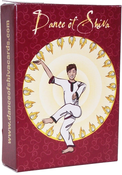
First, I’m excited to see a project that took me a long time and a lot of painstaking work finally get off the ground. Frank Mitchell made a set of Dance of Shiva reference cards, and he hired me to illustrate the 8 arm positions in 64 combinations. I also made the results press-ready for him, so all he had to do was approve the images and then sit back while I sent it all to press (and pay the bills, heh). There was a card back and box art, and while I haven’t seen them in person yet, I’m crazy excited.

Shivanaut by Amy Crook

Shiva Nata Card Box art by Amy Crook

Cartoons

It’s been a week of getting back to cartooning, and I finally finished up most of the pending projects I had.

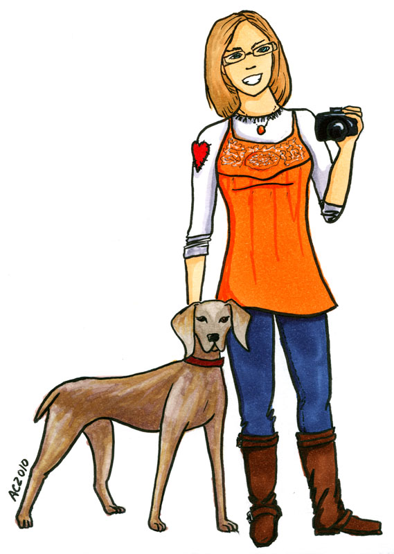
Elizabeth Halt asked me to draw her and her gorgeous puppy, Atlas:

Elizabeth Halt by Amy Crook

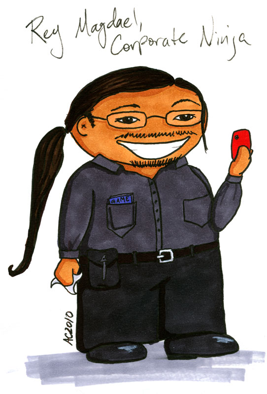
And then my friend Rey wanted to be immortalized as a Weeble:

Rey Magdael by Amy Crook

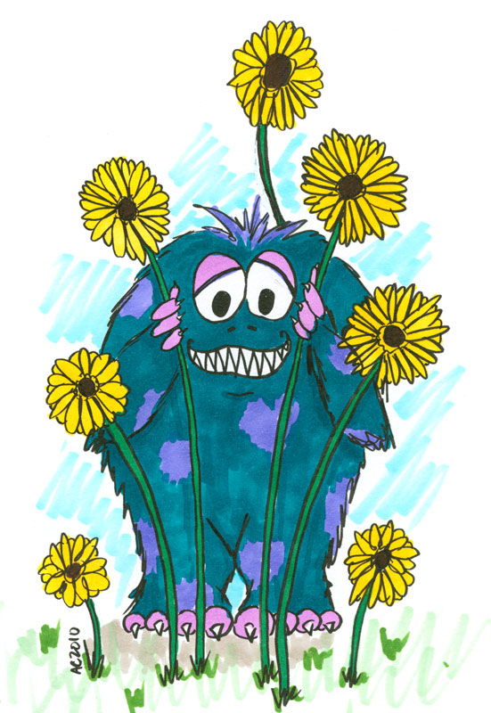
And finally, I drew up one of my Monsters (a la Havi Brooks), to show that he’s really a friendly, wee chap that’s worried for me:

Friendly Monster by Amy Crook

Beach Cottage

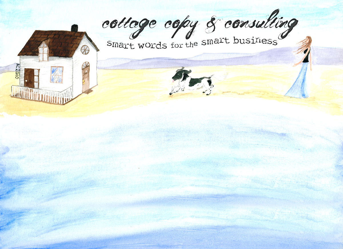
Finally, I’ve got a sneak peek for you at the header for Cottage Copy‘s new look, an original watercolor including the Cottage Copy Spaniel and Holly’s dream beach cottage:

Cottage Copy Header by Amy Crook
(Click to see it in all its full-size glory)


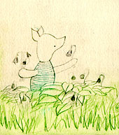
Piglet etching, detail, by Amy CrookI have a confession to make: right now, as of this writing, I only have seven clients. One of those clients has been working with me since I first started out as a lowly desktop publisher back in 1996. One of those clients just hired me at the end of December for a single project. One hired me back in August for a single project that’s just now finishing up, but another hired me for a single project in 1999 and has been with me ever since, so you never know.

The thing is, I never wanted to have so many clients that I needed a CRM and invoicing software just to keep track of them. My needs are, in all honesty, pretty modest — though that’s a confession for another post — and I like having a lot of free time to do whatever I like, whether it’s play Facebook games or participate in NaNoWriMo, make art or read books. It’s that quiet time that gives me the energy and space to incubate my client projects and create something unique, or at least as good as I can manage, for every project.

This small list of clients means that when someone asks to have something changed today, pretty please, I can usually accommodate them. It means I can send out handmade holiday cards, and write something thoughtful and sincere in each one. It means every one of my clients is a person to me, and many of them start as or become friends. It means sometimes I can take a whole day off to go visit someone in their office so we can brainstorm their next big idea together.

I do want to do a little big of expansion this year, and some of that has to do with expanding my own skills. That free time I mentioned above has helped me develop my illustration style on the side, so I can offer some new services. I read marketing blogs as much for the advice I can give to my clients when we’re building their sites as for my own business. What I aim to do is find a balance between money stress and work stress, so that each client gets the best of me, and knows that they’re on a very short list of people who can say that.

Some designers do a wonderful job putting out a site in short time, for a wide variety of clients, and I even sometimes envy them, but that’s not who I am. Every website, every logo, every cartoon requires thought and creativity, trial and error, and time to burble through the creative distillery in my brain until it comes out as refined as I can manage.

With a list the size of mine, each client gets individual attention from me, and while I’ll be the first to admit that sometimes I get tired of hand-holding, most of the time I wouldn’t have it any other way.


Bridget and I are trading guest posts today — enjoy her unique insight!

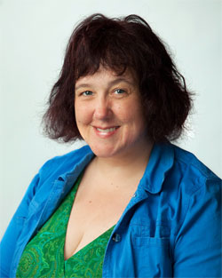
Photo Courtesy of Alicia Dickerson
I work as an intuitive. I have a very unique job. I look at my clients’ chakras and in doing so, I see metaphors about their lives. Each chakra, to me, looks like a little room, or a set on a stage.

The intuitive experience is strange. It’s like Salvador Dali and Frida Kahlo and Lewis Carroll got together and had a party.

In the chakras of my clients, I see swirling or dancing furniture. I see strange people. I see thorns. Broken Glass. Laughing Children. I see colors forming and reforming.

It’s my job to see it and bring it out in the open where it can be useful for people. We use this information to help the client transcend their current conflicts and move forward in their lives.

In intuitive work, we take what’s at the edge of consciousness and make it conscious. We make the metaphors that shape our lives visible.

I want my blog to use visual metaphor just as beautifully, or as interestingly as my clients’ chakras do. So I look to photos and illustrations that capture the feeling of odd, yet familiar.

For example, I was recently writing about working at jobs that don’t sustain you. I wrote a blog post called “What to Do If Your Job is Dead.” Originally, I wanted to find a chalk outline of a dead body. I thought it’d be good to show that you shouldn’t stay in a job that’s killing you, because all you’ll leave is a chalk outline.

I couldn’t find a picture that I liked, but I found this foot with a tag on it, and a sheet behind it, that at first glance looks like ominous clouds. Feet are funny, too. There’s some dark comedy to this shot. It’s memorable, dreamlike and yet, it makes a point. Put a tag on it, it’s done.

Another example: I did a series on the Inner Me. This is an idea where we can talk with our soul and our soul talks back. We can access the warm wisdom within us. I wanted somebody that looks like me to appear in these posts. Since the soul seems ethereal, a hard to pin down concept, I knew I wanted the opposite. I wanted something very warm and accessible.

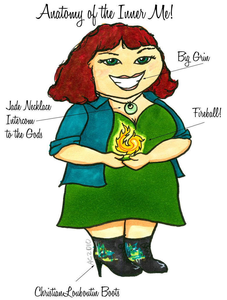
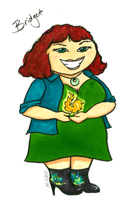
Coincidentally, I had taken Amy up on her Cartoonify Yourself offer. She had made a cartoon of me with a ball of fire and awesome boots. I realized that I was looking at the inner me! So I used her in a series of posts. Now I use her to illustrate my daily soul notes, a little note from the inner me for my readers. She will come up from time to time as I play with this idea of the inner me.

Bridget Pilloud by Amy Crook
The most important take-away from this approach to the visual in my blog, is that it is mostly done from the place of “no-thought”. I don’t have a calculating plan of how I want my blog to be. I just find images that speak to me with visual metaphors that personify the idea that I am getting across.

Bridget Pilloud is an intuitive guidance counselor, an intuition teacher and a facilitator of energetic healing. She also works with people and their pets. Her work can be found at http://www.bridgetpilloud.com and at http://www.petsaretalking.com. On Twitter, she’s @intuitivebridge.


At least, in an ideal world I’d certainly be able to post cartoons every week and be forced to find other days for actual content. 😉

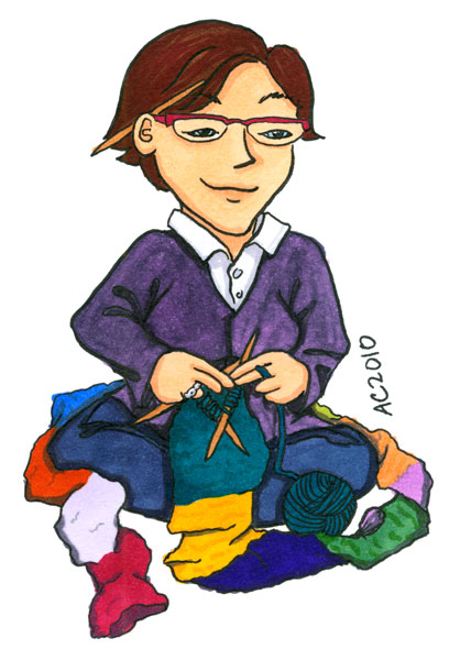
I’ve finally gotten a chance to draw a chibi cartoon of a client, so now there’s examples of someone other than me in all 3 styles. This is Camille Reigle, who’s still putting her Etsy shop together, but I’ll be sure to send you over there when she’s got it ready. She knits awesome stuff (and is kind enough to make special non-wool things for me!)

Camille Reigle by Amy Crook

And then we have the sort of thing I draw when I’m idle, and then make into a Valentine.

Weeble Cthulu and Shoggoth by Amy Crook

If you’d like to prevent more of this sort of thing in the future, feel free to volunteer to Be a Cartoon yourself! The price is going up March 1, so get it while it’s still cheap.


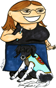
Holly and Didy by Amy Crook
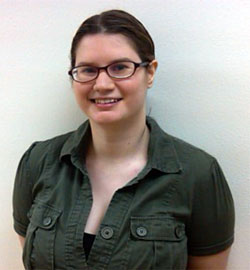
I’m Holly, and thanks to Amy, I am now a cartoon. I am also proud to call myself both a client and friend of Amy’s. So, while I could easily spend all day telling you how awesome Amy is, if you’re reading this, you probably know that already. So, what I’m going to talk about today is going to sound like one of those Alice in Wonderland riddles, but it’s really a simple concept: How is a cartoon like copywriting?

For some background, I’m a copywriter. In particular, I’m a copywriter who specializes in capturing voices. Clients come to me with a sales page, and then a process starts. I listen to them talk, I read their material, and I find out as much about them as I possibly can. All so I can write the wordy equivalent of one of Amy’s cartoons. Which is quite honestly why I wanted a cartoon for my website. Her cartoons capture people in the same spirit as my copy does.

Holly's shining faceBut rather than sound like an ad, I really want to talk about how cartoons and copy are similar, and can serve the same purpose on a website. It’s a whole different way to express yourself on your site, and equally valuable and interesting. Cartoons, by nature, reflect the truth of a person. Cartoons, by nature, are also exaggerated for effect. People are larger, louder, and more colorful in a cartoon. It’s still them, but maybe not the person you’d meet in a business setting, or at the park on a weekend. But that’s great, because if you’re a business, part of the key to making money is being yourself. Not just in a quiet way, but in a loud, colorful and powerful way.

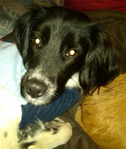
Good marketing copy does the same thing. It captures the essence of you, and then exaggerates it in a way that draws people in, and shows off your personality loudly in the best possible light. Like a cartoon, this doesn’t always equate to loud and obnoxious writing. The true sell is in the details. On my cartoon, it’s the little sweater on my dog that has a royal crest, because he’s named after the canine knight from the movie Labyrinth. Someone is going to see that on my site and know what kind of person I am, just from that little detail. In the amazingly fun world of the internet, I would bet real money that someone would make a copywriting inquiry on that detail alone. That wasn’t something I planned or requested: it was something Amy added from her knowledge of me, and of my love for muppet movies and my dog.

Didy's sweet faceIn an ideal world, that’s what great writing does too. It captures the small details that make up who you are, and presents them in an intriguing and marketable way. It’s not about neon orange and green, or about large bold text with yellow highlighter. When it comes down to it, good marketing, in whatever form is always about people.

That awful overused saying that a picture is worth a thousand words? Sometimes, in marketing, it’s really true. And sometimes, you need the words too, but they need to paint their own picture; one that is equally real, and equally cartoony.

Holly is the founder and chief pirate queen of Cottage Copy, along with her canine co-manager, Sir Didymus. You can find her on twitter as @copygeniusgirl, and on her blog.


First off, congrats to CaZ (@candysbytes) for winning the Tiny Painting (and answering her email)! These take a bit longer than the cartoons, but I’ll be sure to post here when it’s done.

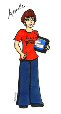
Second, we have a pair of cartoons. First up is Avonelle Lovhaug (@AvonelleL), who wanted to see herself with a sassy Code Poet t-shirt and her tablet PC:

AvonelleL by Amy Crook

And then Holly Jackson (@copygeniusgirl) let me draw her up “weeble style” with her beloved puppy, Didy:

copygeniusgirl by Amy Crook

I’ve had a ton of fun doing these, though they do seem to take longer than I originally thought, so if you want one, get yours soon! I’ll be upping the price on March 1 (once the awesome art sale is over).


I haven’t yet heard back from my Tiny Painting winner (check your spam folders!), so I’m going to delay that announcement for a few more.

Until then, we have — Cartoons!

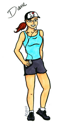
First, there’s the official Contest Winner, Diane Stokes! She’s @DSinAZ on Twitter, and she’s already splashed her new face all over the place, awesome!


And then, the wonderful Bridget Pilloud (@intuitivebridge on Twitter) decided to buy a cartoon of herself, which was awesome. I had great fun designing her Chakralicious fireball, not to mention giving her designer knockoff boots.

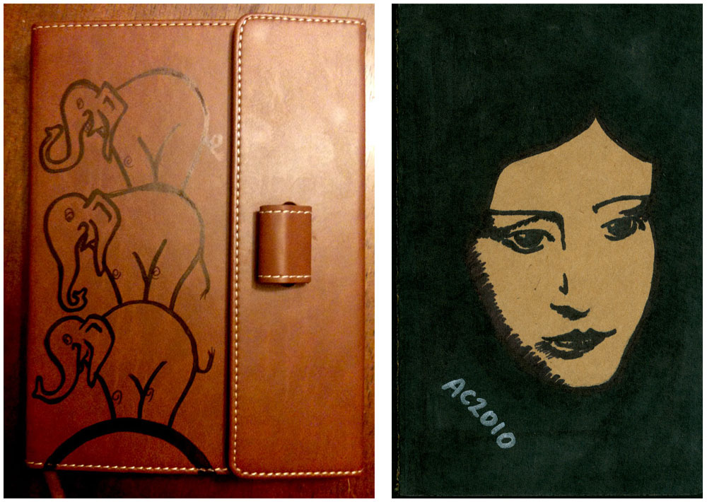
I’m working on a third one for another paying customer (yay!), plus I got to do a great custom Moleskine of Anais Nin for Holly (@copygeniusgirl), as well as an elephantalicious custom journal for her. Sharpie Marker ftw.


Every year I have a giant project that eats up my summer, and I’m happy to say that this year we set our deadline just once, and made the deadline — and it was today!

The 2010 Starcycles Calendar is up for sale at Georgia Stathis’ (the client) site, and she’s already had some pre-order sales!

This annual project is both great fun and great pain for me — the covers are a joy to do, running the gamut of themes and mediums depending on the feel of the upcoming year. This year we did an homage to Henri Rosseau and I painted a tiger (2010 is his year), lurking in his sunlit jungle. I’ll do a whole art post on him later, probably, but for now you can just barely see his golden eyes peering at you out of the foliage.

The great pain is of course doing the calendar pages! It’s a dayplanner style calendar with these wonderfully detailed and tedious visual codes in it. For example, there’s hearts (or broken hearts) for Venus, fog for Neptune, an up-and-down graph to show when the market’s trending, and wicked green shading on all those Mercury Retrograde days, so you always know when you’re scheduling a meeting in the middle of a muddle. The most popular (and most painstaking) feature is the Void of Course moons, which are blacked out on the margins of each day — if a moon is Void from midnight to noon, for instance, the first half of the day is covered in a black bar (at the edges), showing you in no uncertain terms what’s going on.

I love this project, and every year we wonder about doing it, it’s so much work. But Georgia uses it herself, and after 15 years of refining the visual language, it always seems a shame not to. So another year has gone by and it’s done, done, done!


One of the questions that I’ve been asked recently is what it’s like working with me — not just the personality things, but the actual process from start to finish, so I thought I’d see if I could outline the stages a little bit.

Step 1: Finding Me

Most of my clients find me through referrals. I don’t actually have a big client list — maybe 4-6 active clients at any one time — but I’ve kept a few of the same clients for most of the time I’ve been freelancing, which helps a lot. I’ve also been doing some in-person networking lately. I’ve never actually connected with a client through my website, but part of that is because I prefer to work locally and personally with people, and thus haven’t done any SEO to get a wider audience looking at it.

If you’re looking now, and thinking of contacting me, please do!

Step 2: Getting a Quote

Once we’ve found each other, the next step is to talk about your project! I can often give you a rough quote right off the bat, and then once we’ve really gotten down into the goals for your project and the needs you have for its design, I will write up and send a proposal. There are lots of questions to be asked at this stage, and I really like to have an in-person meeting to talk, look at what marketing collateral you already have, and get a clear idea of the scope and purpose of your project.

After that, I’ll email you a proposal that includes a tentative schedule, and a firm price.

Step 3: Getting Started

If you’ve accepted the quote, then I’ll send you a contract with firm due dates and an invoice for the first part of the fee (I request half down on most projects). There will be due dates in there for my work — but also for you, in getting me whatever content you need. And a guarantee that if you hit all your due dates but I miss one of mine, you’ll get a 10% discount at the end.

What comes next is… more questions! And working up a design idea for you (or more than one, if I think there’s a few directions it could go). A lot of times we’ll have worked out a sketch, color palette, or organization scheme during our initial meeting, which makes this next bit go faster. This is also the stage where I need to get any logos or other images from you, so that I have them for making your mock-ups.

You will have gotten or will be getting together any content for the project during this time, as well — copy written, or a copy writer hired, along with any custom photography that needs doing. I can help you find other creative professionals to dovetail along with my work, too, if that’s what you need.

If it’s a website you want, we’ll make sure you’re all set up with a domain and hosting — either by getting that info from you, or setting it up for you. If it’s a print piece, we’ll lay out the specifications and decide on a printer, or start to get quotes. If it’s an ad of some kind, I’ll get the specs directly from the vendor so I know I’m making just exactly what they want, and what you need.

It’ll take a couple of weeks to get through this stage, depending on my schedule and yours. At the end of it, I’ll be able to give you a first draft of your design, and you’ll be able to assure me that the copy is on the way.

Step 4: Revisions

Next, you get up to 3 rounds of revisions on that first draft. This stage can take a long or short amount of time — some clients spend a long time with the drafts before they get back to me, and some turn things around right away. At least a few weeks should be allotted here, and more if you’ve got a committee at your end who needs to approve things.

Step 5: Build

Here’s where I must have your finished copy, and any other final materials (like high-res logos for print jobs, or finalized photographs).

If we’re doing a print piece, this is probably mostly about making sure the job is within the printer’s specs and popping in your final copy, if I didn’t already have it.

If it’s a website, this is where we go from jpgs of what your site might look like, to a real live proof with buttons that work and pages that have actual content on them.

Step 6: Approval

Whatever we’re making, I’ll require a final approval, and the final payment, before it goes live. Files will go off to the printer or advertiser, or the website will launch, and we’re done!

Step 7: Aftercare

You’ve got your site up, but you need some edits? I’ll be here to help you out with that. I have a ‘program’ for those small edits that need to be done, but don’t need to cost an arm and a leg — instead of my usual $40 (half hour) minimum, I allow existing clients to send me small changes, and when they’ve racked up 5 changes I bill them for an ‘hour’, or $80.

Not sure if the email you got requesting a renewal payment is legit? I’ve got all your info saved, and can tell you if that’s a real provider for no charge at all.

Need another order of business cards or brochures? I’ll have you files on hand, and can help arrange it with the printer. If there’s no changes from you or the vendor, this, too, will be gratis.

Got another project? Hopefully you’ll think of me fondly, and bring it my way.

 

…of your sales cycle, that is.

One thing I’ve learned over the years of doing design is the every client has a different sales cycle, and it’s always longer than you wish it was.

Almost all potential clients will respond to a proposal with a thanks, followed by some variation on, “I just need some time to think this over.” (Okay, maybe I just don’t have the sales method down yet, or my proposals are boring, or something, but let’s just pretend I know what I’m talking about here — in my experience, small business owners don’t decide on the spot to spend hundreds of dollars very often.)

What’s interesting to me is that you never really know how much time “some time” will be. I’ve had clients come back after only a few days and accept — or, sometimes, decline — a proposal. I’ve also had people that “thought” for a few weeks, asking for more info and gathering the materials that they need to make an informed decision (and get the project started) before accepting. I’ve even had people who took months to come to a decision, and I have one potential client who’s been considering his website options for over a year now.

The only true rule of thumb I’ve found is that however long you hope a client will take to decide, based on their stated schedule and urgency and what you know of their personality, it’ll always be at least twice that long, and often much longer.

Buying design is more akin to getting a new car than buying a new TV. Despite being priced more in the latter range, it’s non-returnable, and the client is going to have to live with the results. On top of that, it’s got to function for a client who doesn’t always see how good design gives them a return on their investment, and it’s not always easy for the designer to overcome those mental objections. A new car has to get you from point A to point B, but it also has a whole lot of other expectations — both functional and emotional — that it’s expected to fulfill. A client worries that they’re going to spend $500 — or $5000 — on a design only to end up with a lemon, and there’s both emotional and monetary investment there.

After all, a good design (especially if you’re doing brand identity along with it) is supposed to represent them as a business, the same way a lot of people feel like their cars represent them. If they’re expecting a Mini and get a Yugo, they’re going to be disappointed, and the fear of that disparity is going to be one of the unspoken objections that slows down the sales cycle.

So, what’s the solution?

Well, first off a designer needs to put out enough proposals that some people’s sales cycles will complete while the rest are still working their way through. It’s a lot of work, but having a good marketing system in place is essential for every business, of any kind.

Secondly, a designer can figure out these secret objections and counter them, either in their sales copy, or their subsequent conversations with the client. Figure out what the benefits really are, not just the features, and highlight them. Assure the client that you’ll make sure their Mini has racing stripes and isn’t just a glorified go-kart. Don’t give away the farm for free, but front-load your presentation with enough specifics that the client really feels like you get them.

Of course, to do that, you have to have enough conversations with the client that you really do get them, but that’s a subject for a different post.